Swap Widget Example Themes

The Getting Started guide showed how to embed the swap widget and let your users trade tokens on the Pegasys Protocol without leaving your dApp.

Below you’ll find a few examples showing how you can customize the widget theme to match the look and feel of your dApp. All of them can be integrated using the following code snippet where you can set your theme:

import { Theme, SwapWidget } from '@pegasys-fi/widgets'
import '@pegasys-fi/widgets/dist/fonts.css'

const theme: Theme = {
// Check out the theme examples below
}

function App() {
<div className="Pegasys">
<SwapWidget theme={theme} />
</div>
}

Theme Examples

Copy any of the theme object below to start making your own custom appearance for the swap widget. You might also need the right CSS import for any custom fonts.
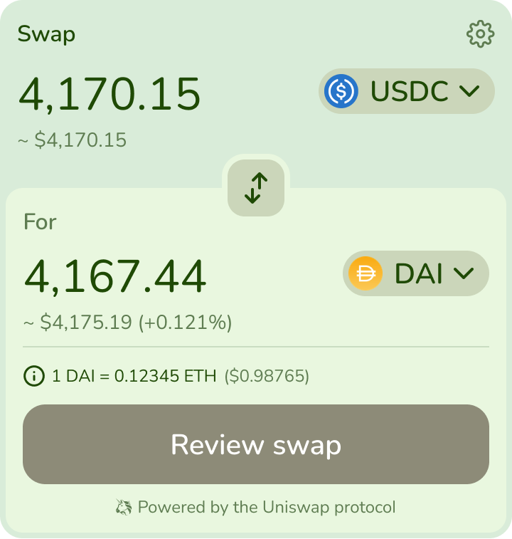
Swap Widget Theme Example 1
const theme: Theme = {
primary: '#1F4A05',
secondary: '#5F7D52',
interactive: '#CBD6BA',
container: '#D9ECD9',
module: '#E9F7DF',
accent: '#8E8B78',
outline: '#CADDC2',
dialog: '#FFF',
fontFamily: 'Nunito',
borderRadius: 0.8,
}
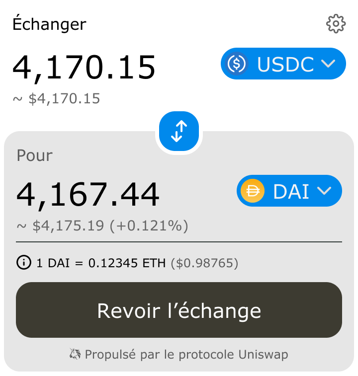
Swap Widget Theme Example 2
const theme: Theme = {
primary: '#000',
secondary: '#666',
interactive: '#0089EC',
container: '#FFF',
module: '#E7E7E7',
accent: '#3D3B31',
outline: '#343D3A',
dialog: '#FFF',
fontFamily: 'Verdana',
borderRadius: 0.8,
}
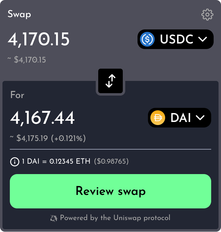
Swap Widget Theme Example 3
const theme: Theme = {
primary: '#FFF',
secondary: '#A9A9A9',
interactive: '#000',
container: '#4E4E5A',
module: '#222633',
accent: '#71FF98',
outline: '#CC1',
dialog: '#000',
fontFamily: 'Josefin Sans',
borderRadius: 0.5,
}
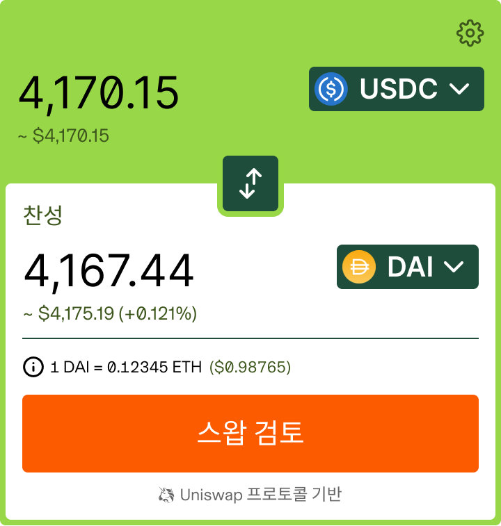
Swap Widget Theme Example 4
const theme: Theme = {
primary: '#000',
secondary: '#A9A9A9',
interactive: '#1E4D3C',
container: '#98D747',
module: '#FFF',
accent: '#FD5B00',
outline: '#1E4D3C',
dialog: '#000',
fontFamily: 'Inter',
borderRadius: 0.2,
}
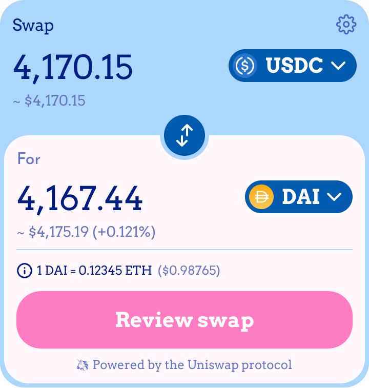
Swap Widget Theme Example 5
const theme: Theme = {
primary: '#001D82',
secondary: '#6677C1',
interactive: '#005BAE',
container: '#ABD6FE',
module: '#FFF7FB',
accent: '#FF7BC2',
outline: '#ABD6FE',
dialog: '#FFF',
fontFamily: 'Arvo',
borderRadius: 1,
}
Swap Widget Theme Example 6
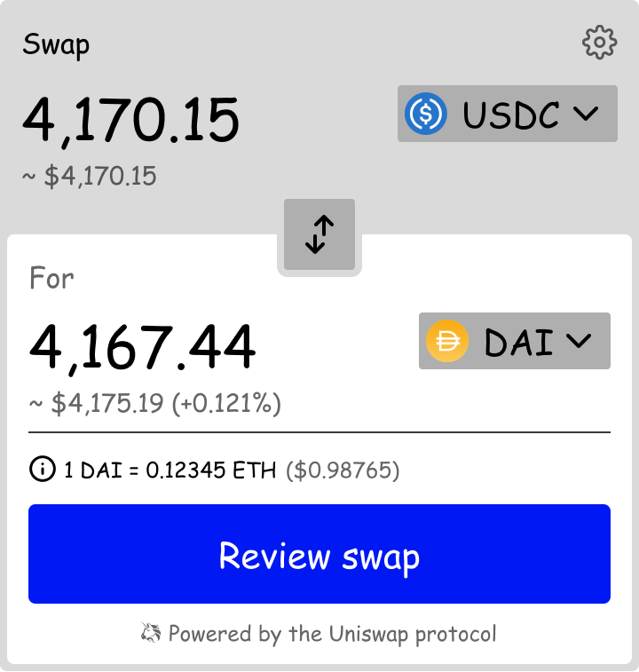
const theme: Theme = {
primary: '#000',
secondary: '#666',
interactive: '#AFAFAF',
container: '#DADADA',
module: '#FFF',
accent: '#0018F4',
outline: '#000',
dialog: '#FFF',
fontFamily: 'Comic Sans MS',
borderRadius: 0.2,
}
Questions?

Join the Discord channel to ask questions and get support from the Pegasys community.